Weather Plus UI Mockup
November 05, 2014
Background
For a group assignment as part of our Software Design I class we were tasked with coming up with an original application design, an accompanying specification document, and UI design. I thought that it came out pretty nicely so I decided to write a post about it. Our full writeup is available here as a pdf download.
The Idea
The idea of a weather app isn’t exactly revolutionary or original; they usually come bundled by default along with every phone along with calculators, calendars, and the like. At a moments notice you can find out the cloud ceiling, atmospheric pressure and have access to a variety of meteorological system maps, its pretty impressive.
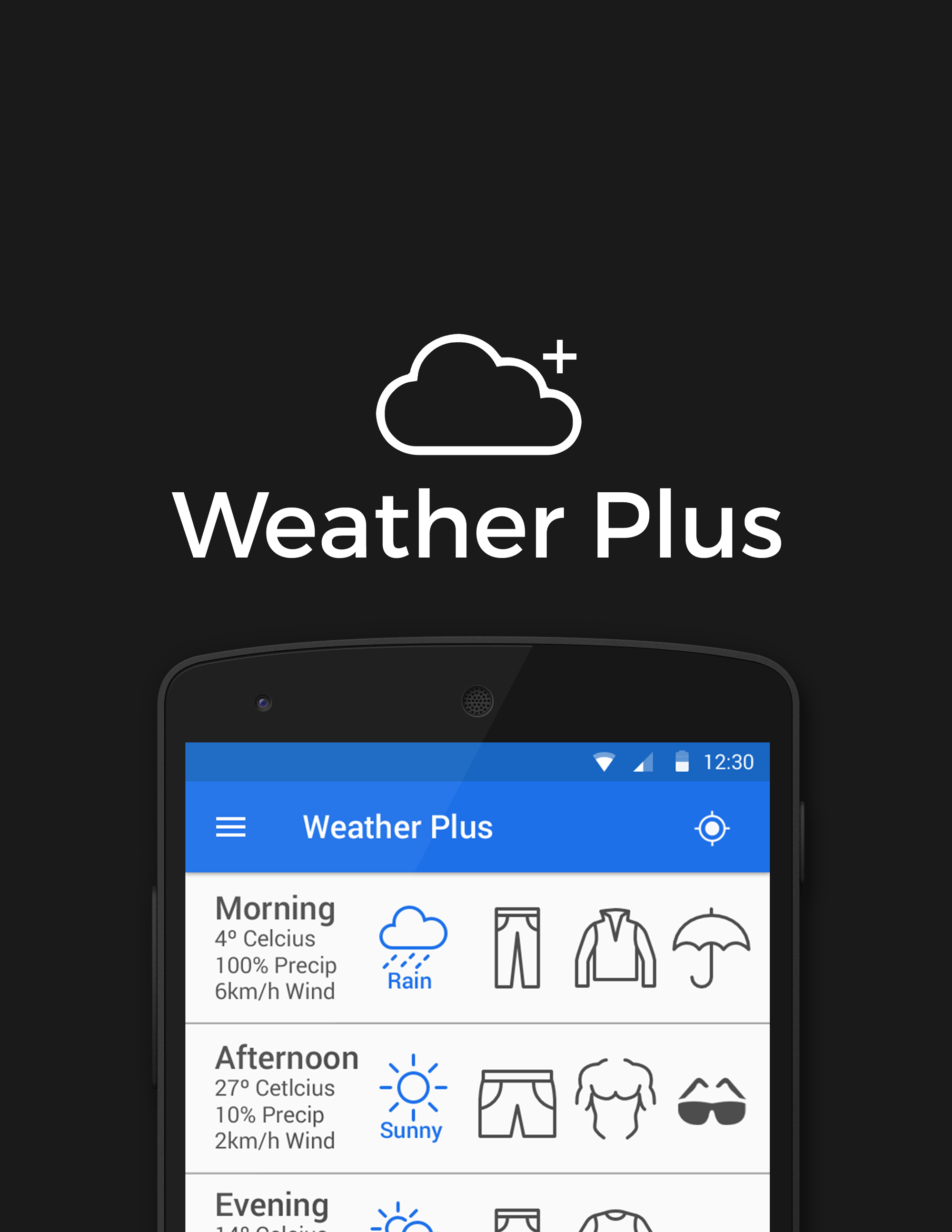
Weather Plus intends to distinguish itself by highlighting the main reason that people want access to this information in the first place– they just want to know how to prepare for the weather, namely what they are going to wear.
The Interface
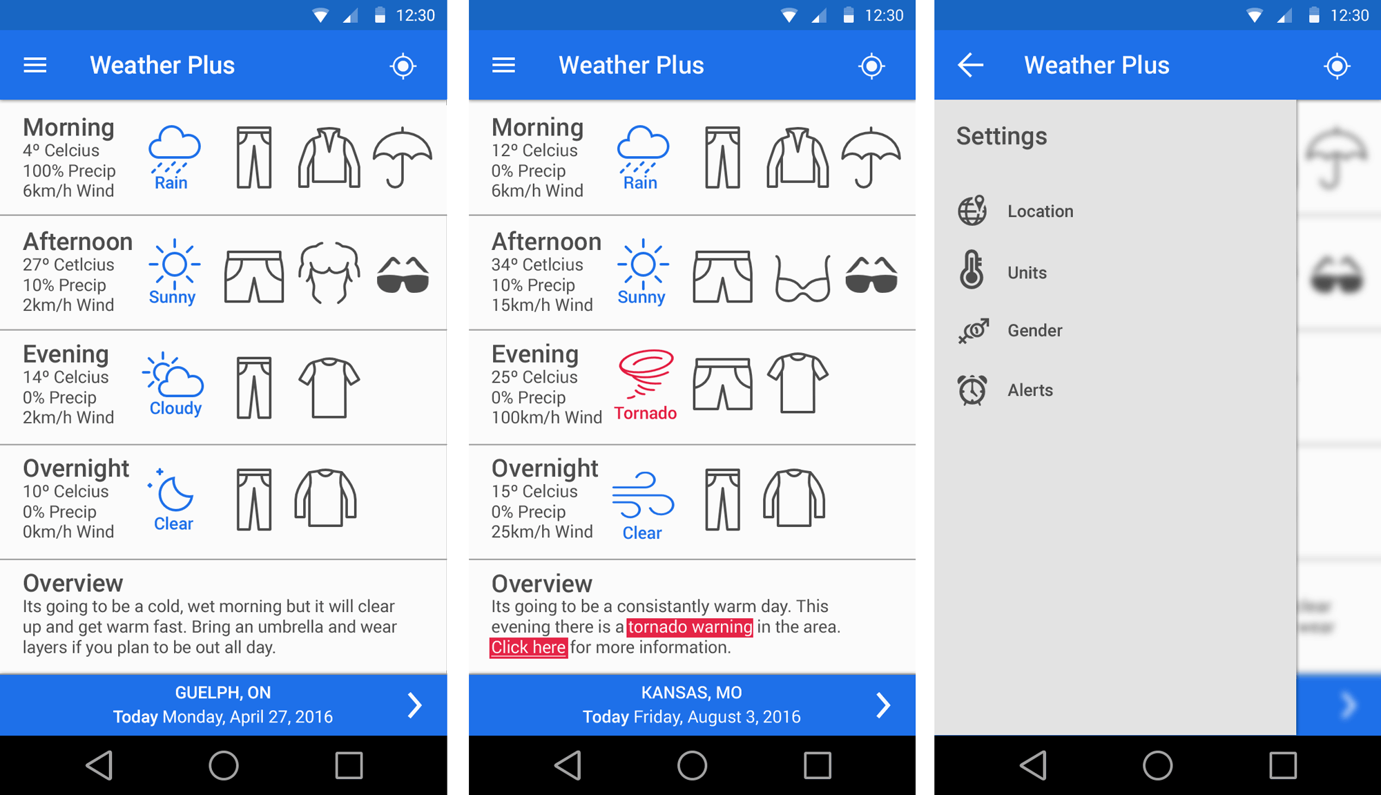
Weather Plus’ interface is intended to facilitate the application’s intent of simply displaying the weather in a meaningful and concise way. Figures like temperature are downplayed and information is conveyed primarily using iconography and colour. At a glance, whether jumping out of the shower or running late to work, the user can easily glean what the weather is going to be like and what they will need to get through the day.
-
UI Elements and ‘Material Design’ Specification; Google Inc. ↩
-
Nexus 5 Device Mockup; Stefan Hinck ↩
-
Android Icons; VisualPharm LLC ↩